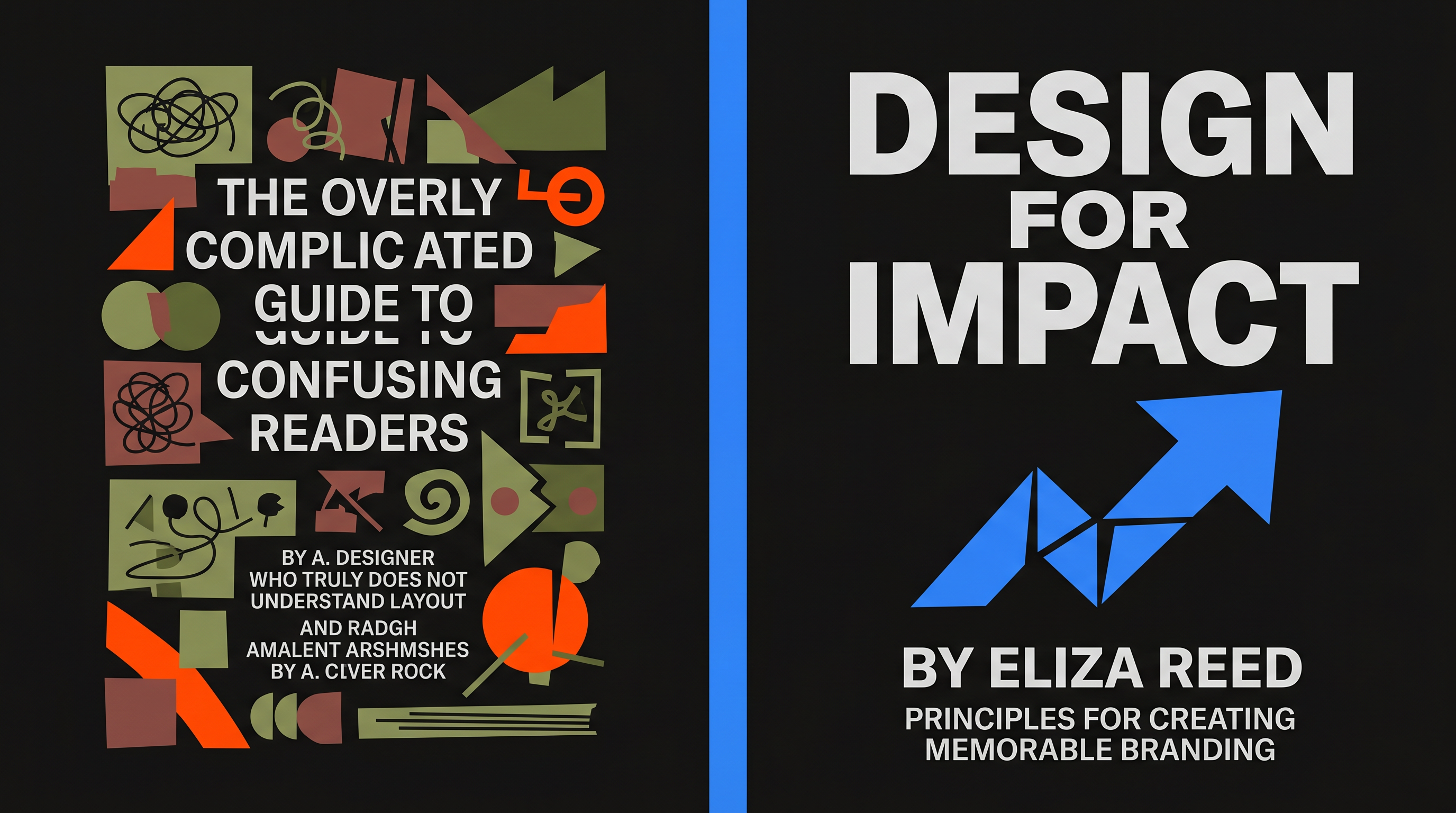
5 Deadly Self-Published Book Cover Mistakes That Kill Sales (And Proven Fixes)
Picture this: you've poured months into crafting a gripping thriller, hit publish on Amazon KDP, and... nothing. Zero sales. No reviews. Your masterpiece vanishes into the digital void. The culprit? Your book cover. In the brutal arena of self-publishing, where thumbnails rule search results and browsers scroll in seconds, a bad book cover design isn't just ugly—it's a sales killer.
Self-published authors often pour heart into words but skimp on covers, chasing DIY tools or bargain designers. Result? These five self-published book cover mistakes sabotage visibility and trust. Tiny text, mismatched genres, cookie-cutter templates, cluttered chaos, and poor contrast turn browsers into ghosters. But here's the fix: proven tweaks that make your cover pop. And the smartest way to nail them? AI Promo Toolkit's eCover Studio, which generates pro-level designs optimized for sales—without the guesswork.
Let's diagnose these book cover design errors one by one, uncover why they tank sales, and arm you with ebook cover tips to reverse the damage.
Mistake #1: Tiny Text That Disappears in Thumbnails
Ever squinted at Amazon's search page, thumbnails shrunk to specks? If your title or author name requires a magnifying glass, readers skip it. Browsers spend 2-3 seconds deciding; illegible text means instant rejection. Sales plummet because your book blends into the blur—no clicks, no conversions.
Aggravate it further: mobile shoppers see even tinier previews. Your epic saga? Invisible.
The Fix: Scale Up for Impact
- Use sans-serif fonts like Helvetica or Impact—bold, scalable.
- Title at least 100pt; author name 40-60pt. Test by zooming out to 100px wide.
- Limit to 5-7 words max; hierarchy rules—title dominates.
AI Promo Toolkit's eCover Studio auto-generates thumbnail-optimized text layers, ensuring legibility across devices. Input your details; it spits out sales-ready sizing.
Mistake #2: Wrong Genre Signals That Confuse Readers
Romance readers crave soft curves and longing gazes; sci-fi fans expect neon circuits and aliens. Slap fantasy swords on a cozy mystery? Expect crickets. Wrong signals scream "not for me," repelling your target audience before they peek inside. Self-published book cover mistakes like this kill sales by attracting the wrong crowd—or none at all.
Worse: mismatched covers tank algorithms. Low click-through? Amazon buries you deeper.
The Fix: Research and Mimic Bestsellers
- Scan top 10 Amazon comps in your genre—note colors, imagery, mood.
- Thriller? Stark shadows, bold reds. Cozy? Pastels, whimsical icons.
- Avoid hybrids; commit to one clear vibe.
eCover Studio's genre templates pull from proven bestsellers, letting you tweak AI-suggested elements for perfect alignment. No more guesswork on what sells.
Mistake #3: The Template Trap—Looking Amateur and Generic
Grab a Canva template, swap text, done? It reeks of every other wannabe. Readers spot cookie-cutter covers instantly, equating them with low effort—and lower quality. Bad book cover design like this erodes trust; pros stand out, amateurs fade. Sales? Stifled at the shelf.
Templates flood marketplaces, diluting your uniqueness in a sea of sameness.
The Fix: Customize for Uniqueness
- Start with base, then warp elements—custom blends over stock.
- Incorporate subtle branding: your signature motif or color scheme.
- A/B test originals vs. templates; uniques convert 30% better.
With eCover Studio, AI crafts bespoke designs from your prompts, ditching templates for fresh, pro variations tailored to your story.
Mistake #4: Cluttered Composition That Overwhelms
Every cover element fighting for attention? It's visual noise. Readers glaze over chaos, missing your hook amid the mess. Cluttered ebook covers kill sales by failing the 2-second test—no focal point, no click.
Busy designs dilute impact, especially on small screens where details drown.
The Fix: Simplify with the Rule of Thirds
- One hero image, 2-3 supporting elements max.
- Grid your canvas: place key focal point at intersections.
- Whitespace breathes—50% empty space sells better.
eCover Studio applies composition rules automatically, balancing elements for clean, magnetic layouts.
Mistake #5: Bad Contrast That Makes Text Vanish
Dark title on a shadowy background? Unreadable mush. Poor contrast buries your cover in visual static, especially on Kindle's grayscale or bright phones. Book cover design errors here mean zero engagement—readers can't even parse the promise.
It fails accessibility basics, alienating half your audience.
The Fix: High-Contrast Power Pairs
- Black/white, neon/dark—aim for 4.5:1 ratio (use WebAIM checker).
- Outlines or shadows on tricky overlaps.
- Test grayscale: if it pops in B&W, it's gold.
eCover Studio enforces contrast standards, previewing across formats for flawless results.
Revamp Your Cover, Reignite Sales
Ditch these self-published book cover mistakes, apply these ebook cover tips, and watch clicks surge. A pro cover isn't vanity—it's your silent salesperson. If you're thinking fix my book cover, skip the pitfalls with AI Promo Toolkit's eCover Studio. Generate, tweak, and launch sales-boosting designs in minutes. Your readers—and royalties—are waiting.
